Answer first
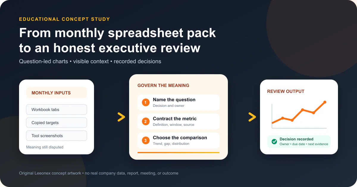
Build the executive review around questions, comparisons, and decision ownership—not around the charts already sitting in a spreadsheet.
A useful recurring performance review should let leaders answer a small set of questions without guessing what the numbers mean. Start with what changed, where a material gap sits, and whether the result is broad or concentrated. Then define the metrics and comparisons required to answer those questions before choosing a chart.
The smallest useful scope is one forum, one audience, three questions, and four to six governed views. Every view should keep its definition, denominator, period, comparison, freshness, and limitation close enough to inspect. The output should record a decision or follow-up—not disappear into next month's deck.
Better visualization cannot repair an unresolved metric or prove why performance changed. When definitions disagree, the design should expose the disagreement and route it to an owner. When the data is not decision-ready, pause the chart and use the dashboard data-readiness checklist first.
Illustrative discovery conversation — not a client quotation
The reporting problem becomes clearer when the team stops asking for a prettier deck and names the decisions the review must support.
Operations lead
“Every month we export the same spreadsheets, rebuild a large slide deck, and still spend the meeting arguing about which number is right.”
Leeonex
“Which decisions should the review produce, and which comparisons do leaders need before they can make those decisions responsibly?”
Operations lead
“We need to know whether performance is changing, where the gap sits, and whether it is broad or concentrated. But definitions and time windows move between teams.”
Leeonex
“Then the first useful deliverable is not a prettier deck. It is three governed questions, explicit metric contracts, honest comparisons, and a decision record attached to the review.”
This is Leeonex-authored teaching material. It represents no real leader, client, company, meeting, report, spreadsheet, dataset, quotation, decision, implementation, or outcome.
Starting situation and buyer
The team has plenty of reporting artifacts but no stable visual contract for the meeting.
This concept is for an operations, finance, research, product, or business leader who runs a recurring performance review. The inputs may arrive as workbook tabs, screenshots from several tools, manually copied targets, and commentary added shortly before the meeting. The pack is familiar, yet readers cannot tell whether differences come from performance, definitions, filters, refresh timing, or presentation choices.
The buyer does not necessarily need a new dashboard. They need a repeatable way to choose evidence, show it honestly, and connect the conversation to a decision. A maintained spreadsheet, presentation, BI page, embedded product view, or custom web experience can all deliver that system. The implementation form follows the audience and operating constraints.
If the core question is which delivery platform to use, compare the options in the BI tool versus custom dashboard guide. This study begins one step later: how the selected review should preserve meaning once the format is chosen.
Decision owner
Names the decision the forum can make, the threshold for action, and the person responsible after the meeting.
Metric owner
Approves the definition, denominator, exclusions, source, time window, freshness, and reconciliation rules.
Review editor
Builds the narrative sequence, writes neutral annotations, exposes missing context, and keeps commentary separate from calculation.
Audience representative
Tests whether labels, comparisons, accessibility alternatives, and drill-down paths support the real meeting task.
Constraints before chart choice
Treat the review as a governed product with a meeting-sized interface.
Definitions move
Teams may use the same label with different denominators, exclusions, states, or time zones. A chart should not conceal that conflict.
Attention is scarce
Executives need a scannable sequence, but compression must not remove the context required to interpret a result responsibly.
The pack must travel
Views may appear on a meeting screen, laptop, tablet, exported PDF, email, or accessible table without losing their meaning.
Core flow
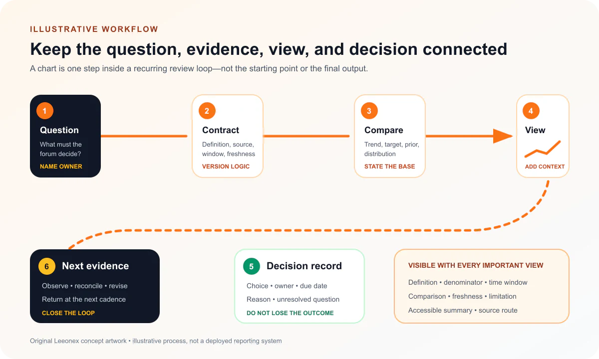
Move from question to contract to comparison to decision.
First, write the executive question in ordinary language and name the decision owner. “Show revenue” is not enough. “Do we change the recovery plan because recurring revenue is below the approved trajectory?” identifies the comparison and the possible action.
Second, create the metric contract. Record the formula, denominator, unit, inclusion and exclusion rules, time window, source, owner, refresh, revision behavior, and known limitations. If two teams cannot approve the same contract, show separate definitions or exclude the metric from decision use.
Third, select the visual form from the question. Establish the comparison before decoration, then add neutral annotations for known events and changes. Finish by recording the decision, follow-up, owner, and due date in the same review output. That last step turns a reporting artifact into an operating loop.
Smallest useful scope
Prove one recurring review before designing an organization-wide visualization library.
- One recurring review with a named audience, cadence, decision boundary, and accountable owner
- Three questions: what changed, where the gap sits, and whether it is broad or concentrated
- A small governed metric set with definitions, denominators, windows, sources, freshness, and known limitations
- Four to six responsive views using the simplest chart form that answers each question
- Neutral annotations for material events, definition changes, missing periods, and unresolved discrepancies
- A review output that records the decision, owner, due date, follow-up question, and link to supporting detail
- Accessible labels, tabular alternatives, contrast checks, and reading order for every important view
Deliberately exclude broad self-service analytics, every department, automated recommendations, forecasts, live alerts, and a universal design system from the first release. They may be useful later, but none is required to test whether one forum can reach better-defined decisions with transparent evidence.
Build now versus later
Build the meaning now; delay optional intelligence and breadth.
Broad self-service exploration
Add filters and drill-downs only after the recurring decision path is stable and users can explain what each choice changes.
Automated commentary
Do not generate explanations until calculation, event context, approval, and unacceptable-error handling are defined.
Forecasting and scenarios
Keep prediction outside the first release unless assumptions, uncertainty, ownership, and evaluation windows are explicit.
More audiences and formats
Do not force board, operator, research, and public-reporting needs into one view before their distinct questions are mapped.
Architecture and implementation
Separate source evidence, governed calculations, presentation state, and human commentary.
A maintainable implementation can use four layers. The source layer retains extracts or queries with lineage and freshness. The calculation layer applies versioned metric contracts and tests. The presentation model supplies chart-ready series, comparison values, labels, missing states, and accessibility alternatives. The review layer adds approved annotations, decisions, and follow-up ownership without rewriting source data.
This separation matters whether the delivery is a spreadsheet, scripted report, BI workspace, or custom interface. Commentary should not silently change calculations; chart configuration should not become the only place where business logic exists; and exported views should retain definitions and timestamps.
Use representative historical periods to test missing values, late revisions, negative values, long labels, dense segments, unusual spikes, narrow screens, PDF export, and accessible table output. Test the meeting flow too: can a reader answer the named question, explain the comparison, find the caveat, and record the next action without an analyst translating every view?
Chart decisions
Match the chart to the comparison the audience must make.
What changed over time?
Line or small-multiple trend
Show a consistent time interval, a meaningful baseline, missing periods, definition changes, and comparable series.
Where is the gap?
Direct target or prior-period variance
State the target source, direction of good performance, units, and whether the comparison is absolute or percentage change.
Is the result broad or concentrated?
Ranked distribution or contribution view
Keep the denominator visible, include the long tail when material, and avoid using an average to hide uneven outcomes.
What needs investigation?
Annotated exception table or focused drill-down
Separate observed data from interpretation and identify the owner of the next check rather than declaring a cause from correlation.
Risks and guardrails
A truthful chart can still fail if its context, access, or use is careless.
- Never let color carry the only meaning. Use labels, icons, patterns, position, or text alternatives so status remains understandable.
- Avoid truncated quantitative axes unless the audience can see the break and the design does not exaggerate a small difference.
- Do not combine unrelated units on a dual axis merely to create a visual relationship. Separate the views or normalize with an explained method.
- Keep actuals, targets, forecasts, benchmarks, and estimates visually and verbally distinct. They are different evidence types.
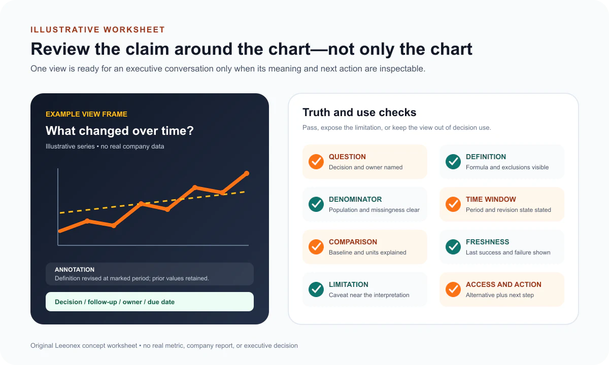
- Show denominator, time zone, aggregation level, exclusions, freshness, and revision status wherever they can change the interpretation.
- Mark missing data as missing. Zero, blank, delayed, not applicable, and not yet reported must not collapse into one state.
- Use annotations for known events and definition changes, not unverified causal stories. Record hypotheses as questions to investigate.
- Provide the source table or accessible summary behind important charts, and test reading order, zoom, contrast, and keyboard access.
- Version the metric and view definitions. A silent calculation change can make a clean trend historically incomparable.
Limitations and evidence boundary
This concept demonstrates planning logic, not reporting performance.
No real company, executive team, spreadsheet, dataset, metric, source system, target, review meeting, chart, decision, or result was studied. The three questions, six truth checks, architecture, worksheet, and visual examples are Leeonex-authored educational choices. They may need to change for audited finance, scientific research, regulated disclosure, board governance, or a particular accessibility standard.
The concept makes no claim about time saved, meeting duration, stakeholder trust, forecast accuracy, decision quality, revenue, profit, conversion, or any other outcome. Before stronger claims were publishable, Leeonex would need approved definitions and source records, a documented baseline, comparable review cycles, a measurement window, usability and accessibility evidence, decision records, attribution limits, stakeholder approval, and permission to publish.
Search metadata, structured data, sitemaps, and AI-readable discovery files support machine understanding; they do not guarantee indexing, rankings, traffic, citations, leads, trust, or conversions.
Lessons from the concept
The most important visualization work happens before and after the chart.
Questions control scope
A named decision question provides a stronger inclusion rule than a request to show every available KPI.
Context is part of the interface
Definitions, comparisons, missingness, freshness, and limitations are not appendix material when they change interpretation.
Decisions close the loop
A review becomes operational when it preserves what was decided, who owns the follow-up, and what evidence should return next time.
What to bring to a first consultation
Bring the meeting and the disputed meaning—not a polished brief.
- The recurring review, its audience and cadence, the decisions it should support, and one recent meeting where the conversation stalled
- The current spreadsheet, slide deck, export, or BI view; metric definitions; source owners; disputed values; and known manual steps
- Required comparisons, targets, segments, time windows, annotations, approval rules, accessibility needs, devices, and export constraints
- Data sensitivity, access boundaries, freshness expectations, change history, reconciliation examples, and any audited or regulated reporting obligations
Leeonex can help with data visualization design, from metric-and-question workshops through responsive embedded views. A responsible recommendation may also be to repair the source definitions, keep the existing tool, or narrow the review before development begins.
Next step
Map one executive review from question to decision.
Share the current pack, the questions leaders ask, and the numbers people debate. Leeonex can map a focused visual system with honest comparisons and a maintainable review path—without pretending that design alone fixes the underlying data.
A first conversation can end with a brief, a definition workshop, a prototype, or a recommendation to defer the visualization build.